
Why the S&P 500 Isn’t “Safe” (and Never Has Been)
Take a look at this chart. Can you guess what it’s measuring?

Is it the S&P 500’s performance over time?
Close! It represents searches for the term “S&P 500” over time.

Why am I looking at this? Well, mostly because I don’t have other empirical ways to get a pulse check on public awareness of a phenomenon beyond Google Trends data. I’m using increasing search volume as a proxy for public interest in the S&P 500 (the index that measures the performance of the 500-odd largest American companies by market capitalization).
Now, we could explain away this increase a few different ways:
The Google search trends data (and the methodology that Emperor Google uses to measure search trends) have changed over time, calling into question the accuracy of such a graph.
Personal finance education has become more popular in the last decade, in part due to the internet and social media.
In short, we could explain the increasing interest in the S&P 500 over the last few years with other stories. Or we could compare searches with actual performance:
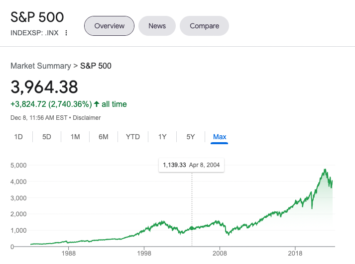
Note the delineation for 2004, where the search trend data above begins.
Correlation does not equal causation, but there’s a simple explanation I’d like to offer here: Recency bias.
Line goes up. People take notice. New investors are attracted. Narrative is formed. (Also known as: Fund flows tend to follow—that is, chase—returns. When something is performing well, it attracts a ton of new cash (Cathie Wood’s ARKK being the most recent, microcosmic example.)
Because the S&P 500 has performed exceptionally well in the last decade (and we’ll get into that shortly), it’s a fan favorite for investors everywhere.
Over time, a very cozy narrative has developed around the S&P 500 and its annualized 9% returns, lulling investors into a dangerous “expectation trap.”
When money is cheap, growth stocks generally pop off
There’s a general consensus in the investing world that there’s a correlation between the Federal Reserve’s monetary policy (specifically, interest rates) and stock market performance. For example, this analysis from BlackRock demonstrates how S&P 500 P/E ratios map to interest rates over the last 12 years; when rates are negative, P/E ratios tend to be higher, and vice versa.
When the cost of borrowing money is cheap, the thinking goes, we expect future earnings—and returns on stocks, the securitized devices that represent a company and its earnings—to be higher.
When the cost of borrowing money rises, we expect future earnings and stock returns to be lower.
There’s a loosely inverse relationship.
And what do we know about the last 10 years? A picture’s worth a thousand words! Below, you’ll see the Federal Funds Effective Rate—a bunch of fancy words that basically mean, “How expensive is it to borrow money?”
The higher the line on the graph, the more expensive money is. Check out the line post-2008, especially relative to the previous 60 years:
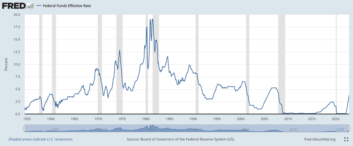
Things have been awfully ZIRP-y.
(ZIRP is the acronym for “Zero Interest Rate Policy,” an approach to monetary policy that tries to jumpstart economic activity by making borrowing money really cheap. In other words, the interest rate is at, near, or sometimes even below zero.)
It’s true that this correlation (between high returns and low rates) exists, but it’s also true that—at other points in history—reality flouted this expectation. Between 1940 and 1969, rates rose and the S&P 500 had positive real returns.
In that sense, it’s not quite as simple as “one goes up, the other goes down,” though this intuitive narrative is very powerful.
I don’t want to get into the ~economic theory~ or effectiveness of ZIRP, or how it played out for us. That would be fun (really!), but what I’m more interested in is exploring how a new era of higher interest rates is likely to shift the narrative sentiment (and therefore, investor behavior) around things like the S&P 500.
Is narrative sentiment more powerful than data?
Do ~vibes~ and public opinion matter more than reality itself? Do vibes create our reality?! (I feel like I’m at Burning Man.)
To dig a little deeper into our earlier note about positive real returns amidst rising rates, LPL Financial released some data in March 2022 that showed the average annualized S&P 500 return during Fed rate hike cycles was 4% (in other words, lower than the historical average, but still positive) since the 1940s.
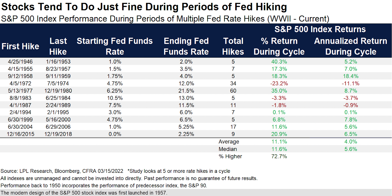
In fairness, the data doesn’t appear to be inflation-adjusted, and you probably don’t really give a shit if your stocks are up on a nominal basis if they can buy less bacon at the store than they could last year.
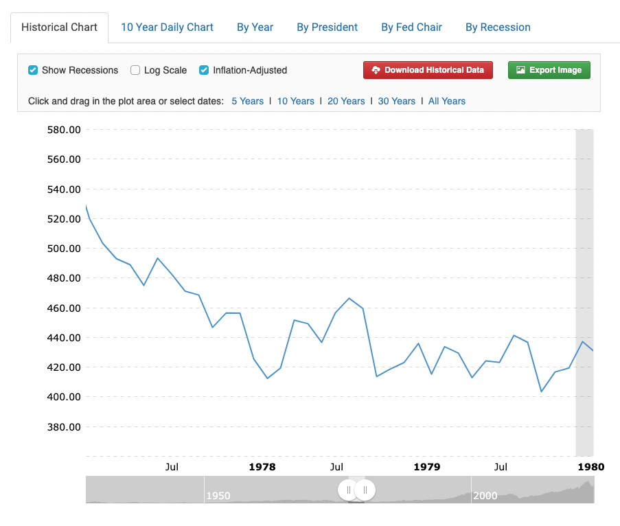
For example, a quick review of S&P 500 returns at this site (where you can easily adjust time periods and include or exclude inflation) paints a very different picture of the period between 1977 and 1980 than the LPL data does:
Regardless, it almost doesn’t matter if rate hikes don’t actually meaningfully impact S&P 500 returns, if everyone investing in the stock market thinks (and behaves!) as though they do.
Data is often no match for the narrative that forms around the data. A compelling, intuitive story is often more powerful than fact.
The end of an era: The “safe bet” of the S&P 500 might be over, for now
When rates are continuously ripping and J-Pow refuses to step away from the “CHAOS & VIOLENCE” button that adds another 50 basis points to the Fed funds rate every few months, we’re going to see a gradual narrative shift in investing circles that moves away from presenting the S&P 500 as a “safe” option.
This is probably a good thing. While you’re historically likely to see real returns over any given 20-year period you’re invested in the S&P 500, we humans have a tendency to take a look at recent history and extrapolate it forward.
Writer and investor Nick Maggiulli points out why this is a dangerous inclination in his recent piece, “How Much Growth Can You Expect?”:
“I wanted to share these results because there are many personal finance gurus who will advertise expected growth numbers far in excess of [real returns] and it can be quite misleading. Most of the expected growth numbers I see tend to be inflated for a few key reasons:
They don’t examine people investing over time (i.e. DCA)
They don’t include bonds in the portfolios (it’s 100% stocks which is unrealistic)
They don’t include Global stocks (they focus solely on U.S. stocks)
They don’t usually adjust for inflation.”
To quote myself five minutes ago, you’re probably more interested in a realistic estimate for future returns that’ll accurately reflect the type of life they’ll enable you to live than some pie-in-the-sky, relatively unlikely outcome.
Am I going to save as aggressively if I think I’ll get 11% annualized returns? No, probably not.
What if I plan as though I’m only going to realistically 2x my savings over 20 years (around 4.5% real annualized returns)? Well, I’d probably save a little differently.
Again, this is a good thing.
“Save like a pessimist and invest like an optimist,”
wrote Morgan Housel, the connoisseur of “human behavior really jacks up our finances, huh?” hot takes.
While I’m sure we all enjoyed the era of S&P 500 dominance (also correlated with the Alabama dynasty of Saban’s joyless murderball, I might add!), realistic expectations for the future matter, because they influence how we behave, plan, and save.
And diversification beyond a single asset class really matters, because the S&P 500 alone is not a surefire bet, even over relatively long periods of time (despite what our recency bias-tainted amygdalas may tell us)—go back just one more decade and we can learn that lesson clearly:
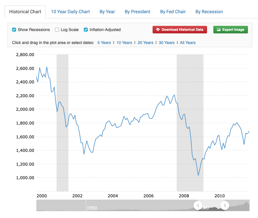
This is real S&P 500 performance from 2000 to the end of 2011, though as Nicky Numbers pointed out above, this represents one lump sum of cash invested at the beginning, rather than a more realistic dollar-cost averaging approach.
Accurate or not, it’s high time for a narrative shift so this new generation of investors can benefit twofold
A more realistic set of expectations for future S&P 500 returns—and, by extension, a more realistic appreciation for diversification beyond it—is good for improving saving behavior, whether the narrative driving this behavior is data-driven or not.
Moreover, deep downturns provide buying opportunities for younger generations (in both the stock market and housing markets) that aren’t possible when ZIRP pushes things to new, outlandish all-time highs every six weeks—anyone sitting on dry powder in 2008 went on an asset shopping spree that likely propped up the rest of their financial lives.
Without these economic blowups and subsequent recessions, the rich stay rich and the young (and broke) get farther and farther behind.
So no, the S&P 500 isn’t “safe”—but if you save aggressively and diversify beyond it, you’d be hard-pressed to find a better way to build wealth.