Copilot Money Review: A Budgeting App that Finally Gets it Right? [Updated for 2026]
December 24, 2025
The Wealth Planner
The only personal finance tool on the market that’s designed to transform your plan into a path to financial independence.
Get The Planner
Subscribe Now
Biggest Finance Newsletter for Women
More than 10 million downloads and new episodes every Wednesday.
The Money with Katie Show
Recommended Posts
Before I was a person with way too many opinions about personal finance, I worked professionally in user experience strategy, design, and writing—a field that I’ve joked saw me ascend the ranks to Associate Manager of Turning That One Button Blue So More People Would Click It. Why am I telling you this? Because when an app has a really stellar UI, I get jazzed.
For the first several years of my financial journey, I used Intuit’s clunky-and-now-defunct (but, crucially, free!) budgeting software Mint.
Copilot Money vs. Mint
While I was always a Mint purist (“And if it doesn’t work for you, you’re just not trying hard enough!” I’d say when people would tell me it just wasn’t working), the more my recommendation was met with hesitancy, the more I felt compelled to find a solution for budgeting that would do for spending what Betterment did for investing. I was on the hunt.
My friend Richard is a quintessential Silicon Valley tech buff (a 2x start-up founder, no less), and when I told him about Money with Katie, the first thing he said was: “Cool! Have you ever heard about Copilot? All my friends love it. The UI is fantastic—one of the founders was a software engineer at Google.”
I downloaded it so quickly, my App Store almost crashed. Then I saw it: the price.
“Aw, man. This costs money? Shit. Never mind.”
But I noticed the demo mode, and it was enough to pique my interest. I played around with the dummy data and immediately felt envious. Then, a few months passed, and curiosity finally got the best of me. I didn’t want Copilot Money to be the one that got away.
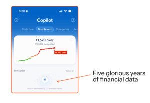
Now, five years later, I’m especially glad I didn’t let my cheapness get the best of me. Not to brag, but I’ve categorized 7,121 transactions (more on that below) since I began using Copilot Money in 2020:

And, as longtime budget freaks will know, Intuit shuttered Mint at the end of 2023.
How to budget, generally
While it may be obvious, I want to make sure we’re on the same page here: I don’t use the budgeting app to decide what my budget should be (though Copilot Money will analyze your spending and give you accurate estimates for each category, including recommendations about how you should reallocate funds based on your actual behavior).
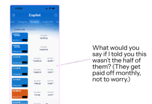
I used my Wealth Planner to make my spending and investing plan for the year, and then simply create identical groups and subcategories in Copilot Money so the app will automatically track my every transaction. (Doing this manually would be nightmarish, as I have a metric shit-ton of credit cards and accounts, as pictured below.)

You could definitely create and manage your budget all in one place using Copilot Money, but I like to have my own records as well. At the end of the month, I record the category totals in my Wealth Planner for accountability and record-keeping. The Wealth Planner is built to give you end-of-month and end-of-year summaries, because data is sexy and makes you rich. Obviously.
The system, when working together, might look something like this. On the left, you’ll see my high-level goals for food spending in my big financial plan in the Wealth Planner, and on the right, you’ll see every restaurant transaction being captured.

A Quick Guide to Copilot Money Transactions
The software is very smart and can generally tell with ease what a transaction is—whether it’s a regular expense, income, an internal transfer (like when your checking account pays off your credit card bill; that’s money that’s already been accounted for as ‘spent’ by the credit card transactions), or a recurring bill.
- “T” — If you see a little “T” inside a square next to the transaction, that was an “Internal Transfer.” You moved money from one account to another.
- “I” — Income. This is interest earned, income earned, or else other money that came in that the software recognizes as net-new.
- “R” — Recurring bill (more on how to set those up below).
You can also Exclude purchases from being counted, which I do with business expenses. (Just tap the transaction itself, which will open a little drawer where you can see details—tap the Category, and on the far left, you’ll see “Exclude” as an option. If you choose that, it’ll vanish. If only actual spending were that easy.)
How to Set Up Your Copilot Money App
I had heard Copilot Money was really “smart”; that it was a budgeting app that understood real life.
But I have to admit, when I first started syncing all of my accounts (which, by the way, were all available in the app with the exception of my obscure HSA fund), I was a little overwhelmed. Months of unrefined data poured in, and I had a brief moment of panic: As someone who checked, categorized, and combed through her Mint data multiple times a day, seeing the last year of my life begin to populate willy-nilly in the app freaked me out and I almost aborted the mission.
I’m so glad I didn’t.
The first thing that I had to do (after syncing my accounts) was begin correcting or approving Copilot’s estimates. Most of them were freakishly spot-on, but some of them required additional tweaking on my part. I noticed that normally happened for categories where I paid for something and then got reimbursed for someone else’s half (think utilities, groceries, rent, etc.). The estimate would guess double my actual out-of-pocket cost because the transactions themselves were twice as big.
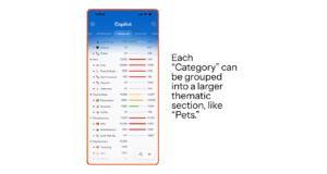
Because I had already built my overall spending plan into my Wealth Planner, setting it up in Copilot was as easy as adding new spending Categories (and grouping them). Here’s what some of mine look like now after many iterations, as of December 2025:

Copilot Money’s Venmo Integration
The good news? If you’re someone who gets reimbursed via apps like Venmo a lot, you can connect your Venmo account so transaction names and amounts will populate like they would in any other account. (Here are some FAQs about how the Venmo integration works; the TL;DR is that you set up email forwarding for Venmo receipts within the Copilot app and that’s how it pulls the data in.)

Recurring Transactions
Another nice feature is “Recurring Transactions,” which analyzes your data to determine (a) what your recurring charges are and (b) when they happen. Then, it builds it into your spending already at the beginning of the month as if the money has already been spent—that way you don’t go on your merry way through your month thinking you’re hella under-budget only to be surprised by your $160 electric bill on the 21st and blow your own lead.
Your Recurring charges live in their own section of the app, so you can keep track of what’s already been paid and what’s still remaining each month.
While setting the actual budget amounts and making sure all the Recurring charges took a little time (probably about half an hour), I’ve been really impressed at how easy it’s been to keep up with and how little ongoing effort it takes. Each Recurring Transaction gets marked with a little “R” in the app. The only Recurring Transaction I use currently is for my rent payment, which happens on the 1st of the month:

Something silly that I’ll admit I loved about Copilot Money: Personalization
You can change category names, colors, and emojis really easily. And while it’s silly to admit, I really liked that aspect of the personalization. Everything works the way you expect it to: Want to change something? Just tap it. Options pop up. It’s not hard to operate, which is crucial for an app that facilitates something as painful for some as budgeting. There’s a level of whimsy to the product and nice haptic feedback (when you tap something, you get a gentle jolt of recognition) that makes regular use of this app a joy.
Why does this silly little thing matter? For the vast majority of us normies who don’t enjoy playing CPA for ourselves on a daily basis, anything that removes friction between you and the act of money management is valuable. Once you play around with the app for a few days and practice categorizing, you’ll see what I mean.
After You’ve Set Up Your Copilot Money App
Understanding the Tabs You Swipe Between
I quickly got to know the major sections of the app because they make really good use of all the real estate. You can move them around based on what you use most often, and my lineup is currently:
- Cash flow, where you’ll see your net income for the year (super addictive to check, if you’re a psycho like me), which you can easily compare to years prior
- Dashboard, which I’d consider the homebase, where you can see a visual for your spending month-to-date, your budget overview (overages are highlighted here), upcoming recurring payments, and income to date — this is where all new transactions that need to be reviewed will appear, so you’ll probably spend most of your time there
- Categories, which is where your budget categories are listed and the “Spent” amount is tracked against the budgeted amount
- Accounts, where you’ll see all your synced accounts and your assets and debt — this is also where you’ll see your net worth at a bird’s eye view
- Investments, where you’ll see your investment holdings by ticker — the cool thing about the “holdings” section of the Investments tab is that if you own the same security across five accounts, it’ll aggregate your total equity here (pictured below)
- Transactions, where it tracks each and every transaction in a simple ledger
- Recurrings, which we’ve already discussed
- Goals, which is actually a feature I haven’t personally used much because my savings goals are automated in my Wealth Planner and I don’t really think about them anymore
And because you pay for Copilot Money, they don’t have to advertise to you—so every section of their app is actually useful and “real,” with no noise from sponsors or ads.

How to Use Copilot Money in an Ongoing Way: iOS, MacOS, iPadOS, and Web
I might be a unique case study since I f***ing love tracking my spending, but I use Copilot like it’s Instagram now. I’m in that shit constantly. I checked my screen time report, and it’s consistently clocking in as one of my top 5. What can I say? I told you I liked data!
When you open the app, it pulls up the dashboard and highlights transactions that have happened since you last logged in, organized by day. You can click “Mark as Reviewed” to let the app know you’ve signed off on them. It’s pretty slick. I’d guess that about 20% of the time, I have to recategorize the transaction, but that takes all of 8 seconds to click the category and select a new one.
Copilot Money is available on…
- iPhone (where I use it most)
- iPad
- Mac (if I’m sitting down to update my Wealth Planner at the end of the month, I’ll usually use the desktop app since it’s bigger and you can see more at once)
- And, recently, web!
That’s something I appreciate about their team: They push new features thoughtfully, and when I get a notification something new is coming, I know they’re going to overdeliver.
Smart-Rebalancing of Your Budget: Why Copilot Money is Good for Beginners & People New to Budgeting
Let’s say you’re relatively new to the magical world of personal finance and you’re still getting your arms around what your typical spending looks like. The Rebalancing feature essentially uses your actual behavior to determine the most optimal way to shift your budgets, but without changing the total amount spent. It reallocates the dollars to the categories where you’re actually spending money, which improves accuracy over time.
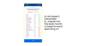
To have Copilot Money rebalance for you, just tap the little magic wand icon in the lower righthand corner of the “Categories” tab, and you’ll see what it suggests based on your spending that month:

Notifications
I’m a freak about notifications most of the time (I turn most of them off), but with banking apps, I’m really paranoid ever since my identity was stolen in 2019. Copilot’s notifications will alert you to any suspected fraud activity right away. I went ahead and gave them full permission to send me whatever they wanted. Blow me up, Copilot. Give me your worst.
It was a “green checkmark” spree as I went through my notifications settings, and I’ve been pleasantly surprised at how respectful the notifications are—I actually don’t feel like I’m getting blown up at all. I tried to go back in my Notification Center to screenshot a sampling, and there weren’t any there…because I’ve clicked on every single one. Clearly, even in the fugue state in which I typically use my phone, I’m entranced enough with the notifications that I engage with them.
Usually, they pertain to spending updates, categorizing new transactions, or letting you know you got #paid.
Is Copilot Money Worth the Cost?
All right, people. Back to the elephant in the room. The original reason I was almost #out on Copilot Money was because it costs money. It’s $13 per month (or, as college Katie would say, two burrito bowls) if you subscribe monthly, or $7.92 per month if you subscribe for the year upfront.
Because I’m a #moneyblogger, I decided upfront it was market research (and therefore a #BusinessExpense! Thanks, IRS). But after using it, I wholeheartedly believe it’s worth the expense, especially if it finally gets you to interact with your spending and track your budgets on a regular basis.
Try Copilot Money for free—use the code KATIE2M at checkout to extend your free trial to two full months, so you can take it for a true test run, free of charge.
Copilot Money has been a sponsor of the Money with Katie newsletter in the past. They had no input in this particular blog post or the opinions expressed herein.
Paragraph
Looking for something?
Search all how-to, essays, and podcast episodes.
Explore
While I love diving into investing- and tax law-related data, I am not a financial professional. This is not financial advice, investing advice, or tax advice. The information on this website is for informational and recreational purposes only. Investment products discussed (ETFs, index funds, etc.) are for illustrative purposes only. It is not a recommendation to buy, sell, or otherwise transact in any of the products mentioned. Do your own due diligence. Past performance does not guarantee future returns.
Money with Katie, LLC.
Terms & Conditions | Privacy Policy
This Site Was Built by Brand Good Time