How I’m Using Copilot’s New “Investments” Feature to Understand My Performance
October 11, 2021


When Copilot announced it was launching a new section of its app, I was pumped. Their former lineup was as follows:
Accounts | Transactions | Dashboard | Categories | Recurring
As I wrote in my original Copilot review, I was immediately sold on the app after realizing how seamlessly it was able to integrate my 22 accounts (yes, 22) into something that was actually beautiful.
Meet the new addition:
Accounts | Investments | Transactions | Dashboard | Categories | Recurring
Since Copilot used to update my net worth once a day, I wouldn’t sit there and watch it move – but I also knew, to some extent, that it was moving throughout the day (because the vast majority of my assets were invested in ETFs whose prices were moving throughout the day), I just couldn’t see it.
Most finance apps pull your investment data directly from the source. They go to your brokerage firm and say, “Yo, what does Becky have in her 401(k)?” and then report that number back to you. That – for obvious reasons – limits the whole “real time data” feed thing, because they’re relying on Bill Behemoth’s website from the 1980s to spit back information.
According to Copilot’s founder, the official features list of the new addition is as follows:
Get a birds’ eye view of your investments.
⏱️ View near real-time market data.
See live balance estimates.
Understand your investment returns.
What does that mean, and how am I using it?
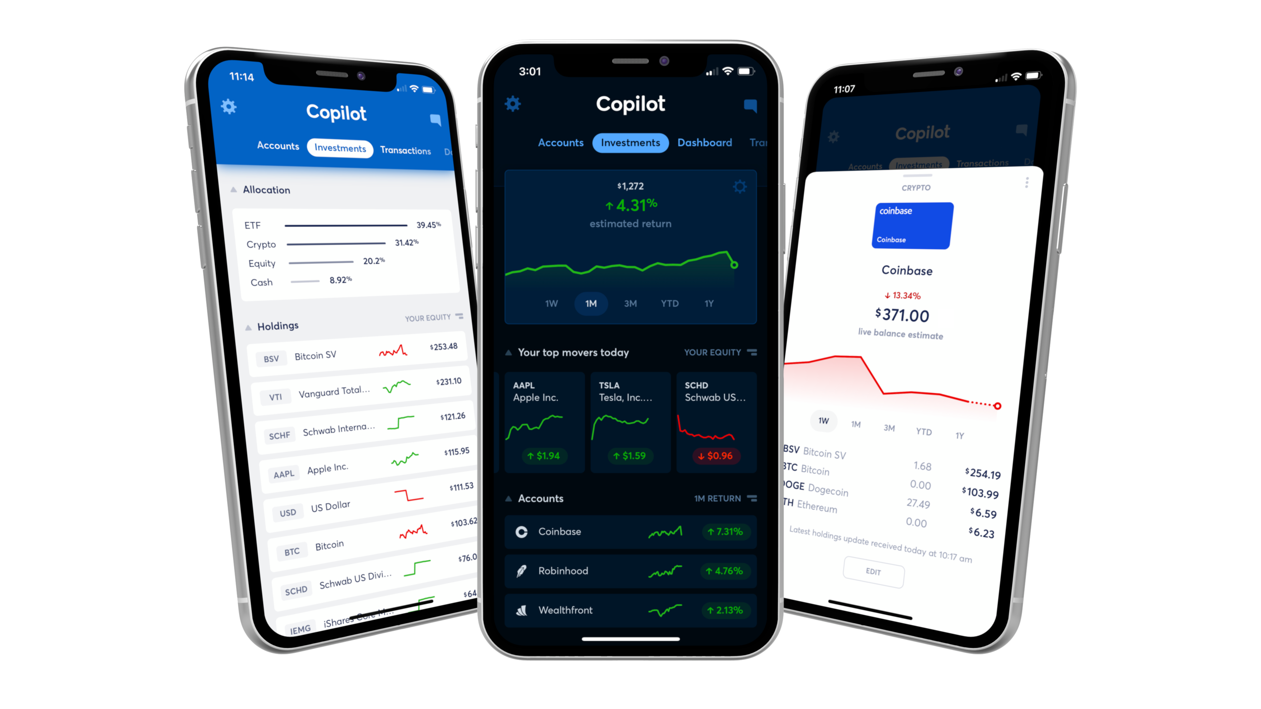
From left to right: The “Allocation” section above the “Holdings,” the top of the Investments tab with the estimated return for the selected timeframe and the “Top Movers,” and a “deeper dive,” so to speak, into one particular account’s performance and holdings.
The cool thing about the “Returns” section is that it doesn’t merely tell you the net increase – after all, if you’re contributing new funds to the account, it’s going to look like things are crushing (when in reality, you’re just adding cash).
The “Estimated Returns” feature that Copilot introduced calculates how your holdings change over time and ignores new money transfers, resembling a more classic time-weighted return metric. This way, you have an accurate understanding of which accounts are doing well, not just which accounts are growing fastest because of your own contributions. Trés chic.
How Copilot adds real-time data to your investments
With the addition of the Investments tab, there’s also some crazy algorithm that basically combines the information it receives from your brokerage firm with real time data about the price of the asset you own – so it can give you a hyper accurate picture of your holdings.
Frankly, I’ve never seen anything like it.
But is having that close of a grip on your holdings – there’s even a section called “Your top movers today,” for example – a good thing?
I thought about this a lot – and while I’m nervous it may unintentionally encourage day trader-y behavior in a small subset of the audience, ultimately, this addition is a really positive thing. Why?
Because honestly, I think a lot of us (myself included) have no idea what we own in some of our accounts.
Seriously! I have this theory that if I walked down the halls at any American mega corp., stopped a random sampling of 15 people in the hallway, held a microphone to their face, and said, “HEY, what’s in your 401(k)?” Ted Lasso-style, I bet fewer than half could tell me with any measure of confidence.
The new “Investments” section breeds intimacy
In my mind, it’s less about knowing at any given moment of the day that the weed stock you bought in 2017 is down 6% today (guilty – damn you, Aurora Cannabis!) and more about having an easy-to-use tool at your fingertips that can aggregate every investing account you have in one place for easy perusing.
I’m probably not going to jump through the dual factor authentication hoops of Fidelity Net Benefits every single day to take a looksy at my old 401(k), but hey, I may swipe past it on “Investments,” notice it’s crushing, and think, “Hm, I wonder what I own in that account? It seems to be doing great right now!”
Even if you don’t end up making any investment decisions based on what you see, it’s wise to know (a) what you’re invested in and (b) where.
I used to try to use Personal Capital for this purpose (specifically for viewing my overall asset allocation in one spot, since I have dozens of accounts of various sizes and holdings) but it always – frustratingly – would lose data connection. It seemed like every time I logged in, everything was broken and required time-consuming re-authentication.
I have no idea how Copilot does it, but I can count on one hand the number of times I’ve had to reconnect a bank account (actually, I can tell you exactly – I had to reconnect my American Express account one time in the last 6 months). That’s it.
When in doubt, zoom out
Another feature that I like about this Investments section specifically is the ability to “filter” the entire page of data based on certain time periods. This is especially helpful in weeks where things are tanking.
In the red for the “1W” timeframe? No worries, just switch that shit to “YTD” and you’ll get a better sense for how things are going this year.
I didn’t discover Copilot until April so my “YTD” view doesn’t span all the way back to January, but you get the point:
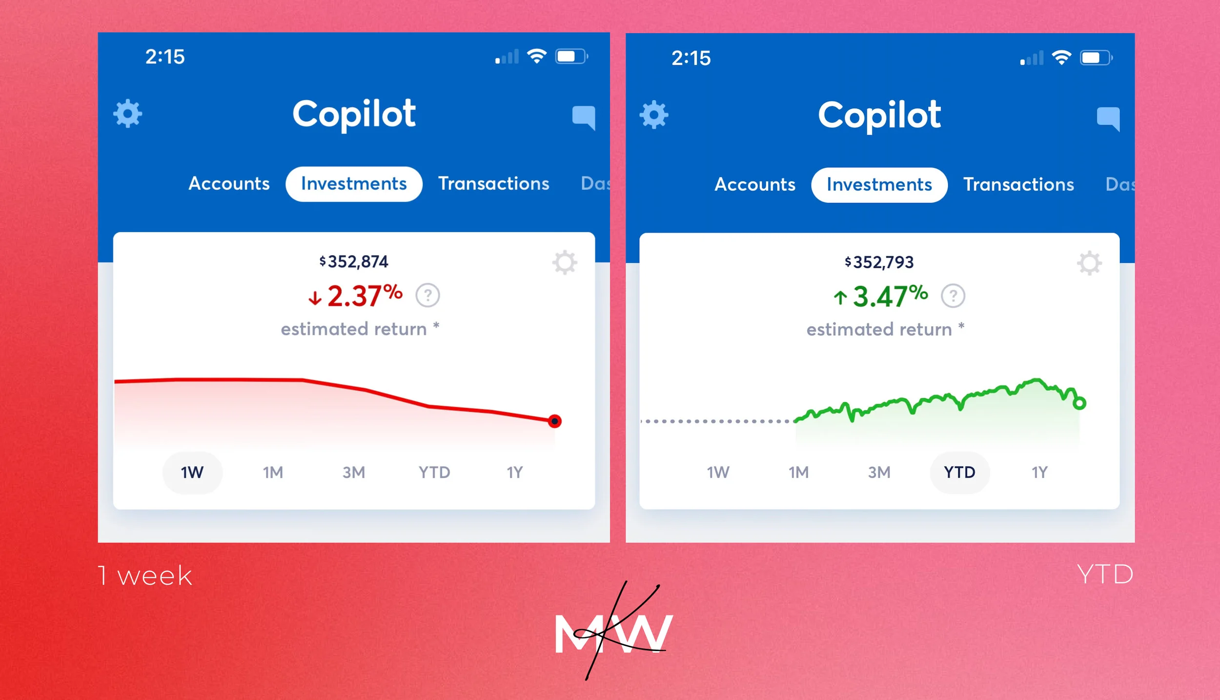
Things can be looking pretty bleak (down 2.37% over one week!), but you have to zoom out to be reminded that you’re still up 3.47% since April (or YTD, if you had it since January).
All the data beneath this section changes, too, as you select different timeframes – so you can see which of your holdings or accounts is performing the best (and the worst) this year. Again, though, I caution you to make any rash decisions based on the data – instead, use it as a constant stream of inputs. Maybe you do own a dog individual stock (Hi, Aurora Cannabis) that you’d probably be best offloading and reinvesting in a broad-based index fund or ETF.
You may have forgotten that you even had them sitting in Robinhood and collecting dust, like I did.
Ultimately, I use it as a reference point
Much like I use Copilot’s “Accounts” section to keep tabs on activity in my various credit card and checking accounts all in one place, I’m going to use the Investments tab to keep tabs on my holdings.
In fact, the “Holdings” section revealed something somewhat alarming to me:
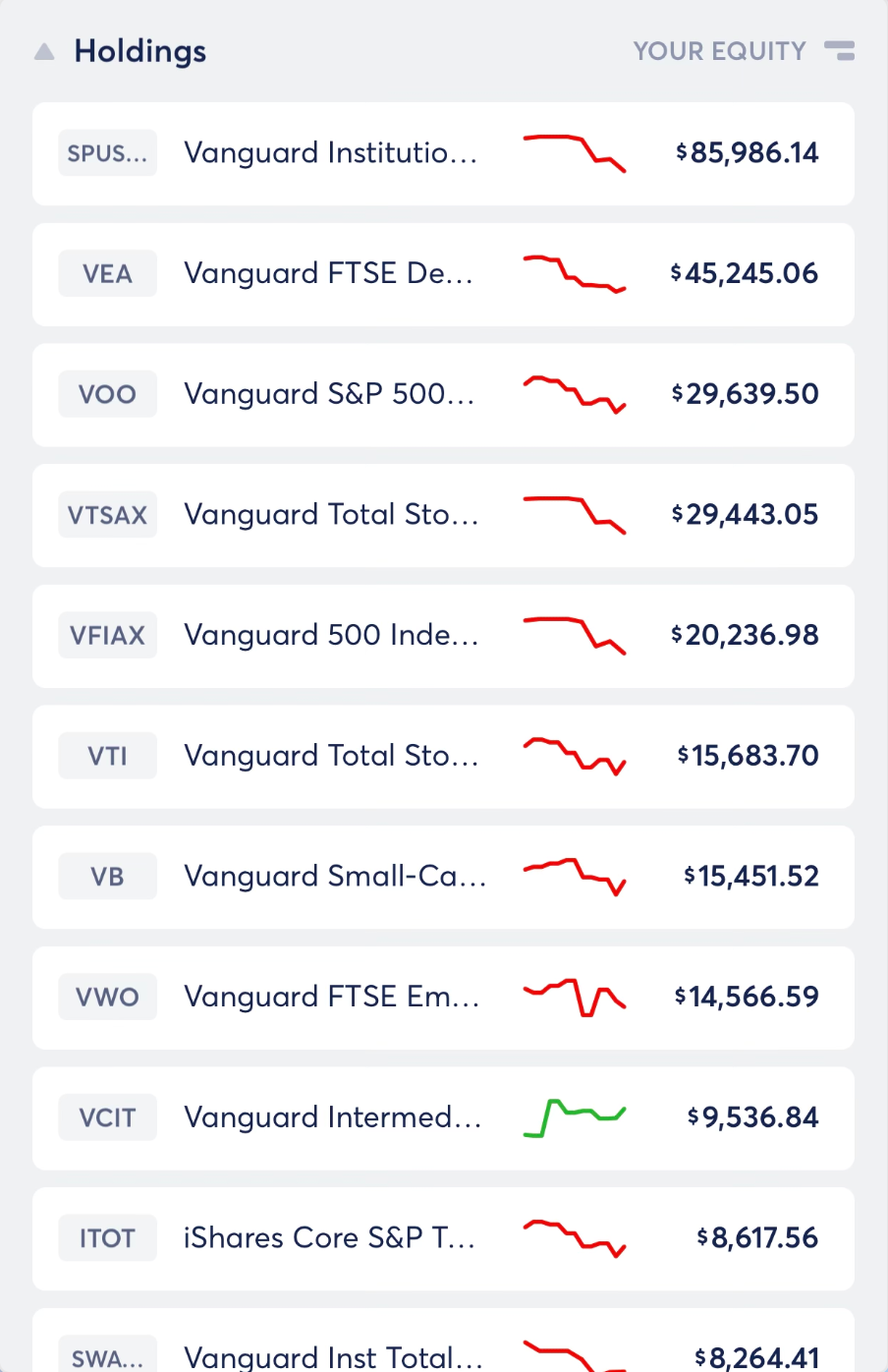
This list keeps going… and going…
$144,478 of my net worth (roughly 39%) is in one asset: the S&P 500! What’s worse, another $45,126 is in the Total Stock Market index, which is – for all intents and purposes – effectively the exact same thing (correlation 0.97; they’re practically identical assets).
That’s more than 50% of my money in large cap growth. And while I knew I’d bought a decent amount over the years, I had no idea I owned that much.
It made me realize I need to start diversifying even more aggressively outside of large cap growth. Until I saw the list of holdings across all of my accounts right in front of me, I didn’t know.
That means VOO, VTSAX, VFIAX, VTI, and ITOT had all been purchased across 4 or 5 different investment accounts, effectively buying a whole lot of the exact same thing.
See why having all this in one place can be interesting, to say the least?
In conclusion
The “Investments” tab is another slam dunk from Copilot, as long as you don’t succumb to any day trading tendencies as a result of having access to so much of your own real time data. With great power comes great responsibility.
The only improvement I’d like to suggest for the next round of iterations is a beefier Allocations section. Ultimately, that’s the only thing that I feel Personal Capital still has on Copilot: It can show you a (pretty cool) breakdown of your asset allocation across domestic, international, stocks, bonds, and more. The current Allocations section on Copilot breaks it up by ETF, mutual fund, equity, and cash, which leaves something to be desired for me.
(When I reached out to Copilot about this feedback, they said, and I quote, “That’s great feedback! We agree, and it’s at the top of the list for future improvements. We update the app every other week with new features and fixes, so we expect to get to it soon along with several other useful enhancements to the Investments tab.” That’s another thing about this app – if you have feedback, you can swipe over to the chat and literally tell them what you want. Pretty cool.)
Get started with Copilot today
The code KATIE2 will double your free trial if you’d like to give the app a try! Just enter it in the “Invite Code” spot when you’re selecting your billing preferences.
Copilot is available in the U.S. and currently only to iOS users (but I believe an Android version is in the works!).
The link above will take you to the App Store. Here’s their website.
Disclaimer
I reached out to Copilot and asked them if they’d be willing to sponsor a review of their product on my site and provide a code for my audience to extend the free trial, and they obliged. They had no input on the content in this post.
You may also like…
Featured


![How to Contribute Thousands of Extra Roth Dollars Each Year: The Mega Backdoor Roth IRA [2025]](https://moneywithkatie.com/wp-content/uploads/2021/10/Frame37846-2.webp)